Showing posts with label Venture Software. Show all posts

Sunday, 22 December 2013

Miss World: Visualizing the Winners

Hi guys,

This post is basically just to show how well you can create a Viz with Tableau, The End :)


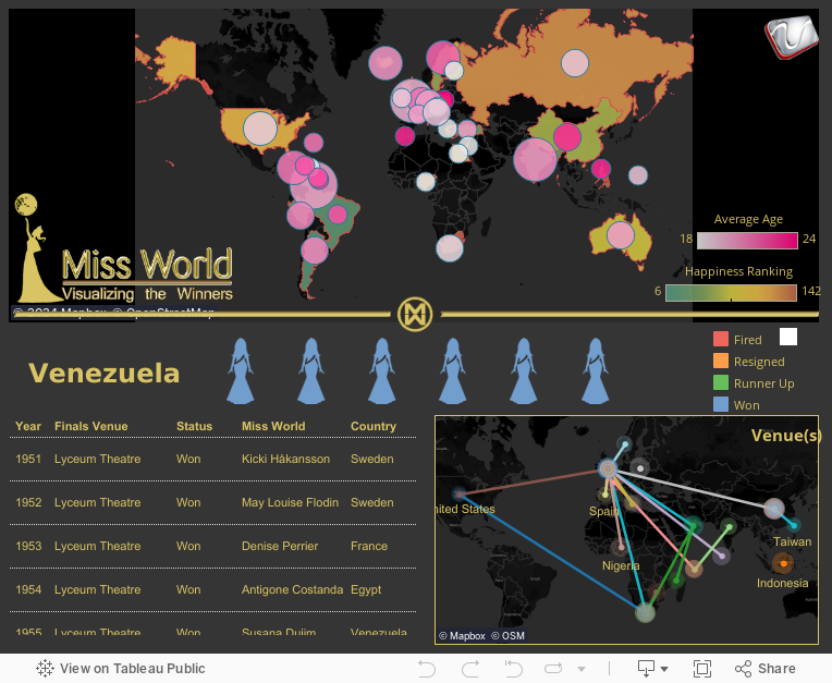
Well, actually its a bit related on my last post "How Happy is the World". In that post I mentioned about how certain regions have a higher Happiness Index than the rest of the world, and pointed out South America as a case. I did mention that probably the women has something to do with it so I did a little digging and got this very nice dataset about past Miss World winners, and surprise surprise, the country with the highest number of winners.. is Venezuela, so maybe just maybe that statement of mine holds some truth in it :)

Take a gander at the Viz below on Miss World winners from the beginning till now.

p/s: Mind you that I do not receive any payment from the Miss World organization nor I am promoting the franchise. This is just a showcase of Tableau, and our capability to produce stunning info-graphics with the tool.


http://www.venturess.com
Like us on Facebook

Tuesday, 22 October 2013

How happy is the world?


Hi guys,

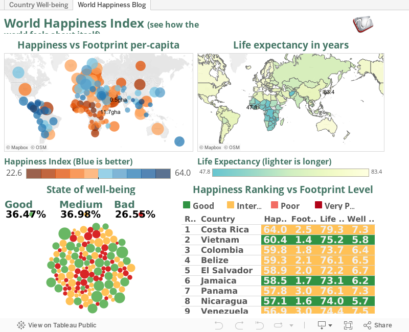
I found this really interesting website by Global Finance regarding the happiness level of the world from some surveys done by the New Economy Foundation. They collected these survey results together into something called the Happy Planet Index. Although the topic of "happiness" to me is very subjective, but the survey did include some interesting data and and how these collected information is relative to being happy in a particular country.

3 factors are incorporated into the Index, 

  1. Ecological footprint; Measured in Global Hectares (gha). It is the amount of land needed to provide for a population's resource requirements plus the amount of vegetated land needed to absorb all their CO2 emissions and in the products they consume.
  2. Life satisfaction; Health as well as “subjective well-being” such as opportunities to undertake meaningful activities, inner resources that help one cope when things go wrong, closeness between friends and family, as well as a sense of community. 
  3. Life expectancy.
Take a look at the Ecological Footprint, It is interesting to see that even though overall it is kinda average, meaning there are some countries with very high footprint, yet still considered happy, and in some cases like in mid Africa, having low footprint didn't do much in terms of happiness, probably because of external factors such as civil war. But overall, countries with a higher footprint tend to be less happy.

Also note that Central and South America seems to be more happy than the rest of the world, their footprint is quite low, and they live longer too. In contrast to Africa, with a somewhat similar footprint, but a different state of well being that definitely have an impact on their life expectancy.

So if you want to live longer, and be happier, pack your bags and settle down somewhere south of the border of the USA. Who knows what makes them all cheery, maybe its the massive party like Mardi Gras or the amazing places like Rio, or maybe its because of all the beautiful women over there (Venezuela has the most Miss World), I'd vote the latter :p

 Post your comments to talk about your observations.

p/s: I feel like moving to Vietnam for some reason

http://www.venturess.com
Like us on Facebook
Wednesday, 4 September 2013

Oil Prices in Malaysia

Good day Y'all,

Post election Malaysia have proven to be an unsettling one, despite the National Front getting only 46% of the votes, they have won GE13. I don't want to talk further on the controversies of the election results, but to discuss on what's happening after the election. So now, post GE13, promises have been made and they must be kept.

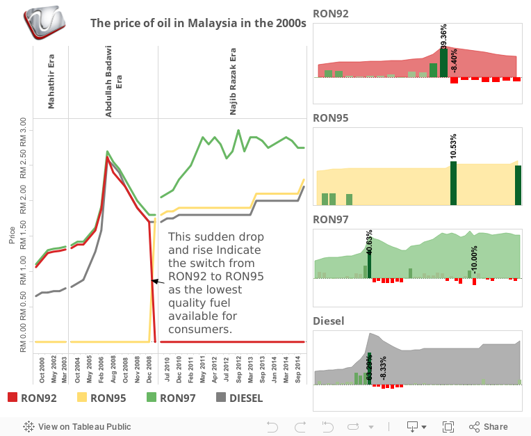
However, one promise that was guaranteed before the election was not fulfilled recently. After ensuring the people that oil prices, especially RON95 would not increase this year, it increased yesterday (3/8/2013) by 20 cents a liter. Of course 20 cents isn't much, but if we calculate the ratio, it is actually an increase of 10.52% and this would definitely affect transportation of all goods thus escalating costs. Maybe to the fat cats its nothing to be shout at, but an increase of almost 11% of living cost would definitely affect the people especially among the poor. I just hope this chosen step to improve our economy is justified.

One question that really boggles me, RON97 is the premium fuel in Malaysia, it is not subsidized and currently it is priced at RM2.70, RON95 is supposedly subsidized at 63 cents at current price it is at RM2.10. RM2.10 + RM0.63 = RM2.73. Is it true that RON95, which is of lower quality than RON97 more expensive than the latter? Or am I missing something here?

**Update: after much chatter in the social media, on 5/9/2013 the government increased the price of RON97 by 15 cents to RM2.85

Anyway, take a look at our Viz below showing the price fluctuations of subsidized oil in Malaysia since 2000.


http://www.venturess.com Like us on Facebook

Sunday, 21 April 2013

What If?: I invested on the S&P since the 50's

Hi guys,

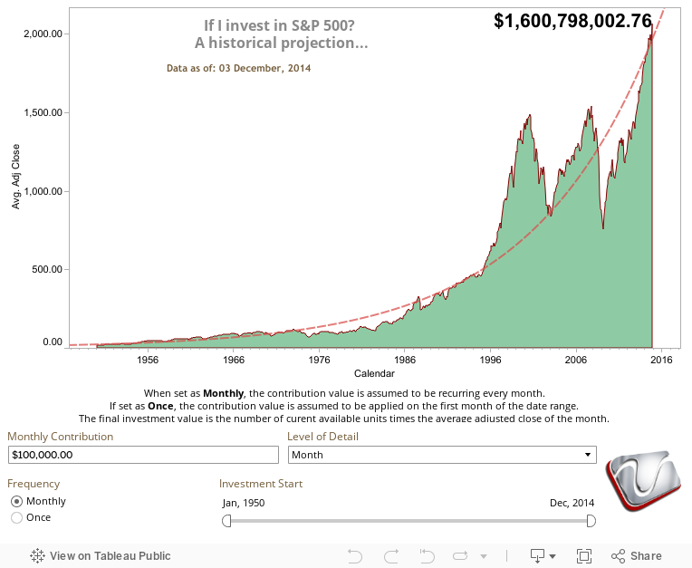
Here's another take of the What If? series. Today's entry is trying to figure out, of sorts, the S&P index of the top 500 publicly listed companies in the United States. For the uninitiated (like yours truly), the S&P 500 index is one of the indices that some investment companies offer as a fund, dubbed as "index fund", that you could invest your money in, these funds is bench-marked to the S&P 500 by holding the same share as the index. This index is traded daily thus hold a very large of historical data that goes back to the 1950s.

Now What If? You started to put money on these index funds and continually contribute on a monthly basis. Based on the historical prices of the Index up to the the time of upload, we have generated the Viz below to reflect on the potential of profit, as well as show the behavior of the index for the past 50 plus years. Imagine contributing money since the 80's or 60's or the 50's, how much your wealth would have grown.

The Data below is provided by Yahoo! Finance and generated with Tableau.

Edit: Updated our Viz with Tableau 8, and added some new calculations and controls :)

-Zan

Hover your mouse on the graph to get more info

Thursday, 31 January 2013

World Internet Penetration From 2000 to 2012

Hi guys,

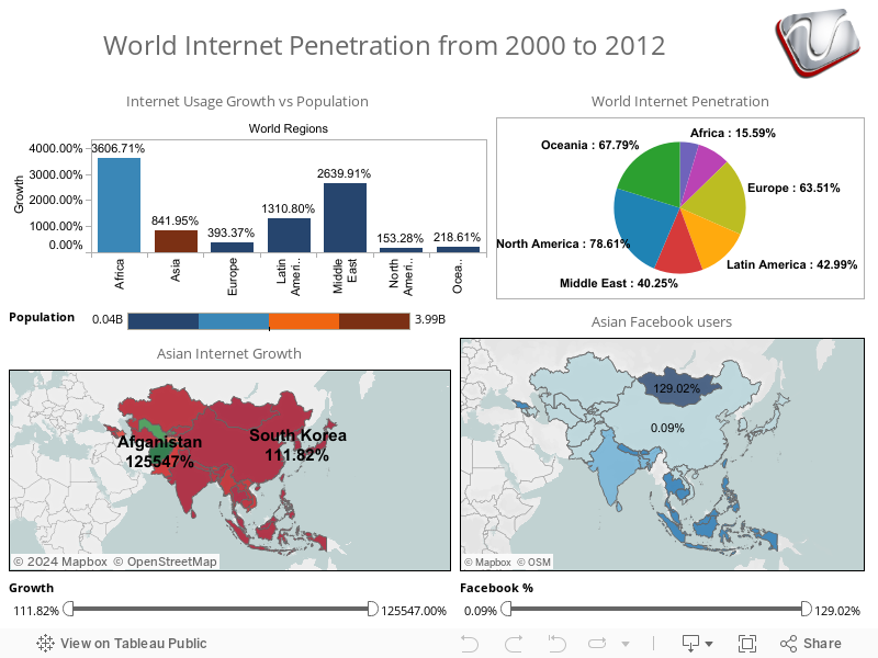
Its been a while since our last posting, we were quite busy for the new year so it was kinda slow for us to find some good Viz to share with you. While lurking around the interweb I've found this very good gem of information about how the internet population have grown since 2000. Represented in the Viz below, it is an eye opener especially when considering how much the internet has grown in Africa compared to Asia. While Asia having the most population, and supposedly bloomed the Internet for the past decade, its the Africans and the Middle Easterners who have taken into Internet by storm with over 2000% growth now thats a lot. Kinda explained why my mailbox is flooded with those Nigerian scams by the minute :p (no offence to my Nigerian friends). In Asia, take a look at Afghanistan for example, a 12000% growth which undoubtedly caused by the American occupation vs North Korea which unfortunately is still trying hard to get out of the stone age. IMHO, that 111% growth would just have come up from the families of the party leaders.

For Facebook fans, surprise-surprise, Mongolia's penetration is 129% which means that all of the population has a facebook account plus some dead ones, or they have this crazy hobby of making 2-3 facebook accounts for fun. Have a look at the Viz below and do give comments :)

-Zan


Wednesday, 7 November 2012

US Presidental Elections 2012

Hi guys,

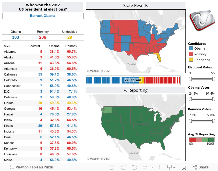
Just whiff up a very quick Viz on the Presidential elections, mind taking a look and comment?

I was following the polls on CNN just now and  thought, "Hey, wouldn't it be cool if I can show this in Tableau?"

So I started looking for the election results which is abundant on the interweb, and took this data off Huffington Post (credit to their very nice visuals on the campaign).

I just directly copied their tabular data into Excel, cleaned up a bit because they were using graphics in the table, then connect to Tableau and build the dashboard below. I know the data is a bit inaccurate (which I have corrected) due to my own stupidity for not checking out Florida lack of knowledge in US polling calculations.. I'd appreciate your comments.

p/s: What's up with Florida btw?


-Zan

Wednesday, 19 September 2012

The Dawn of the Megatall Skyscrapers

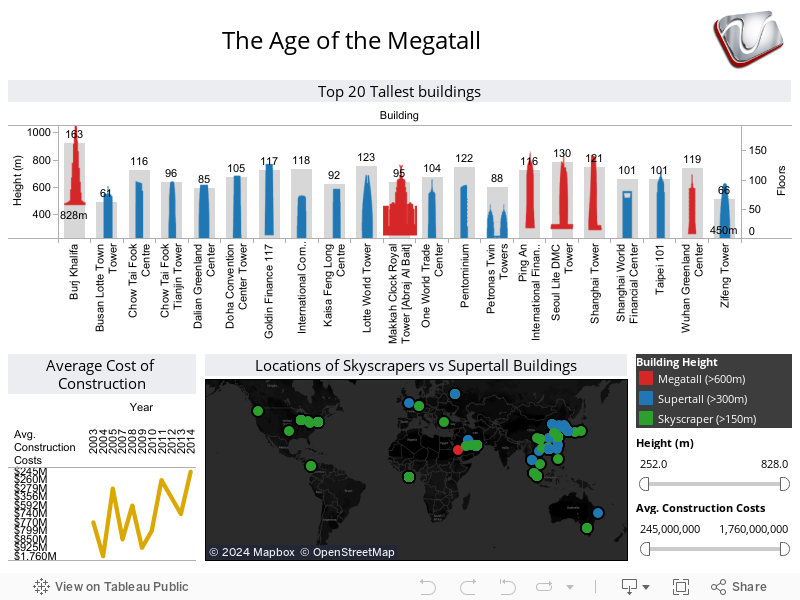
At the dawn of the new millennium, mankind have been racing to show their mark in the world. Traditionally it was the Euro-American countries dominate the skyline. But in recent years a new trend has emerged by the rich Middle eastern conglomerates and new emerging powers such as China and India, they too want to show their supremacy in the skies and literally touch the heavens.

Back in the 80s and 90s, tall skyscrapers were the "in" thing, and american corporations were dominating the skies with 150+ meter towers. However, in the late 90s and well into the new millennium, we welcome the era of the Supertall, beginning with the likes of the Petronas Twin Towers (452m) to the Taipei 101 (509m).

Then, the Chinese came into the race with the Shanghai World Financial Center (492m) and several Supertalls in the pipeline, until the Emirates put everything into overdrive with the Megatall Burj Khalifa (828m) at the turn of the decade. Soon, we'll see the first kilometer high and mile high towers literally scraping our clouds, and who knows far we'd go from there. Take a gander at the Viz below by Venture Software:

(data provided by EMPORIS)

-Zan

Wednesday, 5 September 2012

Multi Level Marketing Revealed!!

This entry today could put off some people, especially those who are hardcore in the business we call Multi-Level Marketing or MLM. Of course by no means I'm trying to be critical of this type of commerce (although I have my own stories of vampirical parasites latching on my dear wallet for a few months just to get "bonuses") ,

Its just so happens that I stumbled upon a website called MLM  The Truth, read the contents, and although some of the facts and figures need some work, I felt that its a good source of alternative info for those who are just considering to join an MLM company, halfway in, or even those hardcore upliners to just think a bit on the actual cost it took to make money in this kind of business.

Now again, from these figures I'm not giving a bad connotation to the MLM business as a whole, being an ex-MLMer myself there were good moments and I learned a lot about fishing (if you catch my drift). But if you are new to this concept, maybe you should just take a look at the Viz below just to be little prepared on what's coming.

-Zan


Images and data courtesy of MLM The Truth, dashboard viz by Venture Software Solutions

So I hope nobody was offended, heck you are welcome to laugh. Put some comments there at the bottom for our entertainment, cheers ;)     -FFA

p/s: To get the real dirt, for Malaysians I believe you guys are already familiar with Aidid Muaddib's blog, its partially in Malay, and don't even talk about the truckload of swearing there, but the info is golden.

Wednesday, 29 August 2012

Employment / Unemployment Rate of Malaysia

Judging from the graphs below, we can see the the number of emloyement rate has bees steadily increasing among the educated however the growth is in tandem with the unemployment rate among the lower education levels as well.

It is also observable that the number of employed among the married and unmarried are on the rise, with a significant rise to married employees, this may be due to the fact that the number of families with both the husbands and wives working have risen due to higher living cost.

-Zan