Sunday 22 December 2013

Miss World: Visualizing the Winners

Hi guys,

This post is basically just to show how well you can create a Viz with Tableau, The End :)


Well, actually its a bit related on my last post "How Happy is the World". In that post I mentioned about how certain regions have a higher Happiness Index than the rest of the world, and pointed out South America as a case. I did mention that probably the women has something to do with it so I did a little digging and got this very nice dataset about past Miss World winners, and surprise surprise, the country with the highest number of winners.. is Venezuela, so maybe just maybe that statement of mine holds some truth in it :)

Take a gander at the Viz below on Miss World winners from the beginning till now.

p/s: Mind you that I do not receive any payment from the Miss World organization nor I am promoting the franchise. This is just a showcase of Tableau, and our capability to produce stunning info-graphics with the tool.


http://www.venturess.com
Like us on Facebook

Tuesday 22 October 2013

How happy is the world?


Hi guys,

I found this really interesting website by 
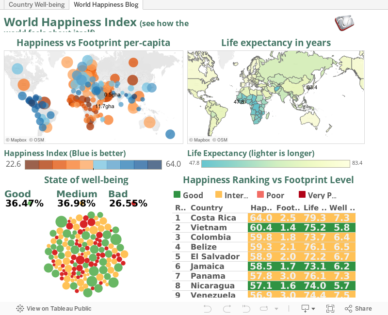
Global Finance regarding the happiness level of the world from some surveys done by the New Economy Foundation. They collected these survey results together into something called the Happy Planet Index. Although the topic of "happiness" to me is very subjective, but the survey did include some interesting data and and how these collected information is relative to being happy in a particular country.

3 factors are incorporated into the Index, 

  1. Ecological footprint; Measured in Global Hectares (gha). It is the amount of land needed to provide for a population's resource requirements plus the amount of vegetated land needed to absorb all their CO2 emissions and in the products they consume.
  2. Life satisfaction; Health as well as “subjective well-being” such as opportunities to undertake meaningful activities, inner resources that help one cope when things go wrong, closeness between friends and family, as well as a sense of community. 
  3. Life expectancy.
Take a look at the Ecological Footprint, It is interesting to see that even though overall it is kinda average, meaning there are some countries with very high footprint, yet still considered happy, and in some cases like in mid Africa, having low footprint didn't do much in terms of happiness, probably because of external factors such as civil war. But overall, countries with a higher footprint tend to be less happy.

Also note that Central and South America seems to be more happy than the rest of the world, their footprint is quite low, and they live longer too. In contrast to Africa, with a somewhat similar footprint, but a different state of well being that definitely have an impact on their life expectancy.

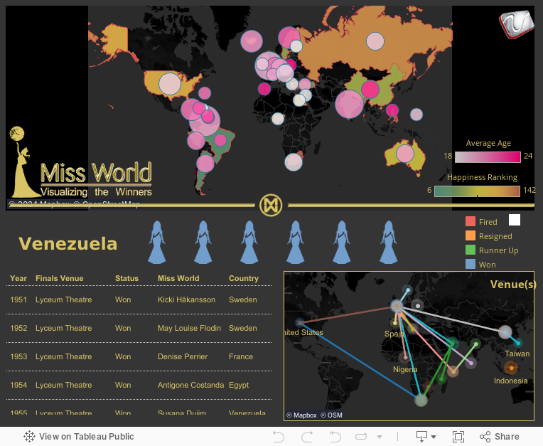
So if you want to live longer, and be happier, pack your bags and settle down somewhere south of the border of the USA. Who knows what makes them all cheery, maybe its the massive party like Mardi Gras or the amazing places like Rio, or maybe its because of all the beautiful women over there (Venezuela has the most Miss World), I'd vote the latter :p

 Post your comments to talk about your observations.

p/s: I feel like moving to Vietnam for some reason

http://www.venturess.com
Like us on Facebook

Wednesday 4 September 2013

Oil Prices in Malaysia

Good day Y'all,

Post election Malaysia have proven to be an unsettling one, despite the National Front getting only 46% of the votes, they have won GE13. I don't want to talk further on the controversies of the election results, but to discuss on what's happening after the election. So now, post GE13, promises have been made and they must be kept.

However, one promise that was guaranteed before the election was not fulfilled recently. After ensuring the people that oil prices, especially RON95 would not increase this year, it increased yesterday (3/8/2013) by 20 cents a liter. Of course 20 cents isn't much, but if we calculate the ratio, it is actually an increase of 10.52% and this would definitely affect transportation of all goods thus escalating costs. Maybe to the fat cats its nothing to be shout at, but an increase of almost 11% of living cost would definitely affect the people especially among the poor. I just hope this chosen step to improve our economy is justified.

One question that really boggles me, RON97 is the premium fuel in Malaysia, it is not subsidized and currently it is priced at RM2.70, RON95 is supposedly subsidized at 63 cents at current price it is at RM2.10. RM2.10 + RM0.63 = RM2.73. Is it true that RON95, which is of lower quality than RON97 more expensive than the latter? Or am I missing something here?

**Update: after much chatter in the social media, on 5/9/2013 the government increased the price of RON97 by 15 cents to RM2.85

Anyway, take a look at our Viz below showing the price fluctuations of subsidized oil in Malaysia since 2000.


http://www.venturess.com Like us on Facebook

Monday 8 July 2013

The Haze issue, who's affected?

Hi guys,

If you've been waking up to the smell of burnt forests lately, well you're not alone. Unfortunately due to some unscrupulous people who have no respect for the environment in a country that shall not be named, we have to suffer the choking hazard. Having a toddler of my own has made me very concerned, and utterly angry at these money hungry animals. Its not just the smoke that concerns me, but the sub PM10 particles (particles less than 10 microns) that's being carried by the smoke. These particles are so tiny that it penetrates our lung tissues, and get collected in our body for years, potentially causing lung diseases and even cancer. You can checkout  about PM10 particles here and also here.

The Viz below is an overview on the Air Pollution Index between 24th - 30th July 2013, data was taken from the Department of Environment Malaysia. The particular week was chosen because it had the highest air pollutant level in 2013 so far. The index has 5 different levels, the air quality level is considered good at levels 50 and below, anything above 100 is considered unhealthy, and if the index reaches 300 it is already hazardous. As a comparison, during the 1997 haze crisis, the index reached a maximum of 930, which gave a visibility of 10 meters. In the recent haze, my area of Shah Alam, reached at about 280, anything beyond 1.5 km is completely blanketed by the haze. Luckily so far it seems that the worst is over, but remembering what happened in 1997 where mortality rates jumped 70% especially for the elderly and the very young, one can never be too careful.

Move the slider to see the different dates, click the chart to highlight and filter information, and hover your mouse on any location for more details.

p/s: The sudden reduction of the index on the 26th was due to quite a decent rainfall particulaly around Shah Alam and Klang.


Like us on Facebook

Wednesday 15 May 2013

Malaysia PRU13 Analysis

General election in Malaysia had just over on 5th May 2013. Let's have a closer look at the parliment formation and the election results from Tableau. Tableau can help you to see the whole picture at just a single interactive view. Of course, you can use your creativity to perform more analysis from the data. Perhaps the politicians or strategiests can uncover more insights from the data by using this very powerful yet affordable software.

Move the slider in the chart to start your analysis.

Like us on Facebook

Wednesday 24 April 2013

Malaysia Political map Revisited

Hi,

A while back I posted something about the Malaysian Political scene since 1986, and if you are aware about the Malaysian politics, finally the 13th General Election is upon is after such an agonizing wait. This GE could turn out to be a make or break deal for Malaysia especially the opposition party Pakatan Rakyat (PR) or People's Coalition, which also added some unimaginable pressure for Barisan National (BN) or the National Front, to prove their tried and tested governance of 56 years. By the time you are reading this, Malaysia's future could have unfolded as the world watch. Hopefully, you've been watching in delight as democracy is being practiced with intelligence and maturity rather than in anarchy. So crossing fingers, we only hope for the best regardless which party succeeds, we only wish that it is the people who ultimately won.

Since this is a revisit to our dear old Viz, I've upgraded it with some insights on how the Malaysia's poorest living under $5 have been doing since 1986 and also a little look at a survey on what Malaysians generally want change in their government. Also you can see that I've incorporated some cool Tableau V8 features inside.

Its interesting to see that at 2004 our nation's middle and poor class have totaled to more that 10 million, which is about a third of the people of the country, a direct impact of the 1998 financial crisis no doubt. But amazingly, the people trusted the then prime minister Tun Abdullah enough that it translated into a huge win for BN and the number of middle to poor class were lowered in 2008. So hopefully we'd see the same trend in 2013.

So pray for the best, and wish us luck on 5th May 2013. See ya.

-Zan


Sunday 21 April 2013

What If?: I invested on the S&P since the 50's

Hi guys,

Here's another take of the What If? series. Today's entry is trying to figure out, of sorts, the S&P index of the top 500 publicly listed companies in the United States. For the uninitiated (like yours truly), the S&P 500 index is one of the indices that some investment companies offer as a fund, dubbed as "index fund", that you could invest your money in, these funds is bench-marked to the S&P 500 by holding the same share as the index. This index is traded daily thus hold a very large of historical data that goes back to the 1950s.

Now What If? You started to put money on these index funds and continually contribute on a monthly basis. Based on the historical prices of the Index up to the the time of upload, we have generated the Viz below to reflect on the potential of profit, as well as show the behavior of the index for the past 50 plus years. Imagine contributing money since the 80's or 60's or the 50's, how much your wealth would have grown.

The Data below is provided by Yahoo! Finance and generated with Tableau.

Edit: Updated our Viz with Tableau 8, and added some new calculations and controls :)

-Zan

Hover your mouse on the graph to get more info

Thursday 31 January 2013

World Internet Penetration From 2000 to 2012

Hi guys,

Its been a while since our last posting, we were quite busy for the new year so it was kinda slow for us to find some good Viz to share with you. While lurking around the interweb I've found this very good gem of information about how the internet population have grown since 2000. Represented in the Viz below, it is an eye opener especially when considering how much the internet has grown in Africa compared to Asia. While Asia having the most population, and supposedly bloomed the Internet for the past decade, its the Africans and the Middle Easterners who have taken into Internet by storm with over 2000% growth now thats a lot. Kinda explained why my mailbox is flooded with those Nigerian scams by the minute :p (no offence to my Nigerian friends). In Asia, take a look at Afghanistan for example, a 12000% growth which undoubtedly caused by the American occupation vs North Korea which unfortunately is still trying hard to get out of the stone age. IMHO, that 111% growth would just have come up from the families of the party leaders.

For Facebook fans, surprise-surprise, Mongolia's penetration is 129% which means that all of the population has a facebook account plus some dead ones, or they have this crazy hobby of making 2-3 facebook accounts for fun. Have a look at the Viz below and do give comments :)

-Zan