Wednesday, 13 August 2014

World Road Fatalities

Hello everyone,

In the wake of the recent air disasters that had unfortunately befallen one of the best airlines in the world. Some of us couldn't help but wonder whether it is still safe to air travel?

Sentiment towards the Malaysian Airlines have grown increasingly negative since MH17, especially from foreigners. Having huge reputation as one of the best airlines in the world also did not help in staving off detractors. MAS has taken such a huge toll that recently, it had a massive reshuffling under its new owner, Khazanah Nasional Berhad.

However, we should be practical in judging and reacting towards the sentiment. Let's look at a few details:

1. MH17 was shot down - there's nothing anyone could do about it.

2. MH370 was a very rare occurrence - If we acknowledge the conpiracy theorists, How many airlines pilots in Malaysia is that geeky to have his own Flight Simulator at home? I bet you know the answer.

3. Forget air disasters, people die from traffic related accidents a hundred-fold compared to a plane crashing. You should be more afraid to drive your car, or take a bus!!

So you see, sentiments aside, Air travel is still the safest way to travel by far, and condemning a particular airline for something unprecedented that had happened to them is too cruel. Mas is a victim, just like the lives that was lost. We pay our respect to the deceased.

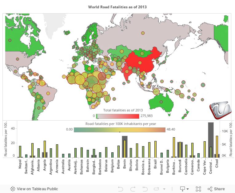
Now to ponder furthermore, below is a Viz detailing traffic related fatalities as of 2013. As I said, when entering a car, you should be very afraid  :). The green represent the least number of fatalities, and Red represent the most. The bubbles are the rate of fatal accidents occurring per a subset of population. Color represents  the number of traffic fatalites per 100,000 people. And the size of the bubble, represent the number of fatalities per 100,000 vehicles. When you look at it, it makes sense that China and India, even though they do have the biggest total number of fatalities due to their population count. They are one of the moderates in fatalities per 100k of vehicles and population. This is most probably due to the number of population who could not afford to buy their own vehicles. I'm just surprised to see Africa leading the number of deaths per 100k vehicle. Does this mean that they have too much cars that even a baboon can go around driving? 


Thursday, 20 March 2014

160 Years of Missing Aircrafts


#pray4MH370

Sadness, grief, and a burdening sense of missing someone you dearly love. That's how I imagine what the families and friends of the ill-fated Flight MH370 from Kuala Lumpur to Beijing. Being a Malaysian, its the first time we had an incident this big involving our national carrier. And being in my 30s, its the first time I witnessed such a disaster albeit only on the media, however I can really feel how the whole nation is crying.

For the uninitiated, at 0122 8th March 2013 local time, Malaysia Airlines FlightMH370, a code share with China Southern Airlines lost contact with air control towers in Malaysia and Vietnam. After signing off with the Malaysian air traffic control, the flight was supposed to report their status with Vietnam air traffic control but never did. A few hours later, the Malaysian authorities made public the incident and droves of speculations poured in ever since. At this moment of writing, which is 13 days later, MH370 is still missing and it was reported that the Australian maritime found via-satellite what could be debris from the aircraft but are still unsure.

graphic credit to The Daily News

I do not want to delve into speculation, but there are quite some puzzling details that has turned this event into an international mystery. The fact that there are signs that the ACARS and transponder were deliberately turned off, how the flight immediately changed its direction westward across the Thai-Malaysian border undetected (well it was but the military didn't know what to make of it, both Malaysia and Thailand), and somehow the plane purposefully followed a route that made radar detection difficult and then off to either the Indian ocean or somewhere in Kazakhstan; Has definitely cranked up the rumour-mill and open the floodgates of endless debates and conspiracy theories  that only increase the anguish of the families of the victims. All I want to say is that I pray that whatever fate has befallen MH370, the answer would come soon and give closure to those affected, deep in my heart, I want this to be over soon.


Please feel free to check the Viz below, detailing aerial disappearances across different modes of air travel for the last 160 years. The bar chart represents the total number of victims, click each bar to isolate the map to each time period, drill down the period to see individual years. Click the bar charts to isolate the map to a particular period of time, hover on the aircraft icons to get more details.

MH370, please come home soon.

update on 25/3/2014: on 24/3/2014, the Malaysian Prime Minister announced that MH370 ended its flight in the Indian Ocean somewhere west of Perth. This is based on data crunching done by AAIB via inmarsat. However, no physical evidence yet available till now.


source: wikipedia
http://www.venturess.com
Like us on Facebook

Sunday, 23 February 2014

BI and Analytics Product Comparison

Do you know how the BI users compare a product with a closer peer?
How is the detail rating and review of the products? The visual graphic below serves this purpose clearly....

Sunday, 22 December 2013

Miss World: Visualizing the Winners

Hi guys,

This post is basically just to show how well you can create a Viz with Tableau, The End :)


Well, actually its a bit related on my last post "How Happy is the World". In that post I mentioned about how certain regions have a higher Happiness Index than the rest of the world, and pointed out South America as a case. I did mention that probably the women has something to do with it so I did a little digging and got this very nice dataset about past Miss World winners, and surprise surprise, the country with the highest number of winners.. is Venezuela, so maybe just maybe that statement of mine holds some truth in it :)

Take a gander at the Viz below on Miss World winners from the beginning till now.

p/s: Mind you that I do not receive any payment from the Miss World organization nor I am promoting the franchise. This is just a showcase of Tableau, and our capability to produce stunning info-graphics with the tool.


http://www.venturess.com
Like us on Facebook

Tuesday, 22 October 2013

How happy is the world?


Hi guys,

I found this really interesting website by Global Finance regarding the happiness level of the world from some surveys done by the New Economy Foundation. They collected these survey results together into something called the Happy Planet Index. Although the topic of "happiness" to me is very subjective, but the survey did include some interesting data and and how these collected information is relative to being happy in a particular country.

3 factors are incorporated into the Index, 

  1. Ecological footprint; Measured in Global Hectares (gha). It is the amount of land needed to provide for a population's resource requirements plus the amount of vegetated land needed to absorb all their CO2 emissions and in the products they consume.
  2. Life satisfaction; Health as well as “subjective well-being” such as opportunities to undertake meaningful activities, inner resources that help one cope when things go wrong, closeness between friends and family, as well as a sense of community. 
  3. Life expectancy.
Take a look at the Ecological Footprint, It is interesting to see that even though overall it is kinda average, meaning there are some countries with very high footprint, yet still considered happy, and in some cases like in mid Africa, having low footprint didn't do much in terms of happiness, probably because of external factors such as civil war. But overall, countries with a higher footprint tend to be less happy.

Also note that Central and South America seems to be more happy than the rest of the world, their footprint is quite low, and they live longer too. In contrast to Africa, with a somewhat similar footprint, but a different state of well being that definitely have an impact on their life expectancy.

So if you want to live longer, and be happier, pack your bags and settle down somewhere south of the border of the USA. Who knows what makes them all cheery, maybe its the massive party like Mardi Gras or the amazing places like Rio, or maybe its because of all the beautiful women over there (Venezuela has the most Miss World), I'd vote the latter :p

 Post your comments to talk about your observations.

p/s: I feel like moving to Vietnam for some reason

http://www.venturess.com
Like us on Facebook

Wednesday, 4 September 2013

Oil Prices in Malaysia

Good day Y'all,

Post election Malaysia have proven to be an unsettling one, despite the National Front getting only 46% of the votes, they have won GE13. I don't want to talk further on the controversies of the election results, but to discuss on what's happening after the election. So now, post GE13, promises have been made and they must be kept.

However, one promise that was guaranteed before the election was not fulfilled recently. After ensuring the people that oil prices, especially RON95 would not increase this year, it increased yesterday (3/8/2013) by 20 cents a liter. Of course 20 cents isn't much, but if we calculate the ratio, it is actually an increase of 10.52% and this would definitely affect transportation of all goods thus escalating costs. Maybe to the fat cats its nothing to be shout at, but an increase of almost 11% of living cost would definitely affect the people especially among the poor. I just hope this chosen step to improve our economy is justified.

One question that really boggles me, RON97 is the premium fuel in Malaysia, it is not subsidized and currently it is priced at RM2.70, RON95 is supposedly subsidized at 63 cents at current price it is at RM2.10. RM2.10 + RM0.63 = RM2.73. Is it true that RON95, which is of lower quality than RON97 more expensive than the latter? Or am I missing something here?

**Update: after much chatter in the social media, on 5/9/2013 the government increased the price of RON97 by 15 cents to RM2.85

Anyway, take a look at our Viz below showing the price fluctuations of subsidized oil in Malaysia since 2000.


http://www.venturess.com Like us on Facebook

Monday, 8 July 2013

The Haze issue, who's affected?

Hi guys,

If you've been waking up to the smell of burnt forests lately, well you're not alone. Unfortunately due to some unscrupulous people who have no respect for the environment in a country that shall not be named, we have to suffer the choking hazard. Having a toddler of my own has made me very concerned, and utterly angry at these money hungry animals. Its not just the smoke that concerns me, but the sub PM10 particles (particles less than 10 microns) that's being carried by the smoke. These particles are so tiny that it penetrates our lung tissues, and get collected in our body for years, potentially causing lung diseases and even cancer. You can checkout  about PM10 particles here and also here.

The Viz below is an overview on the Air Pollution Index between 24th - 30th July 2013, data was taken from the Department of Environment Malaysia. The particular week was chosen because it had the highest air pollutant level in 2013 so far. The index has 5 different levels, the air quality level is considered good at levels 50 and below, anything above 100 is considered unhealthy, and if the index reaches 300 it is already hazardous. As a comparison, during the 1997 haze crisis, the index reached a maximum of 930, which gave a visibility of 10 meters. In the recent haze, my area of Shah Alam, reached at about 280, anything beyond 1.5 km is completely blanketed by the haze. Luckily so far it seems that the worst is over, but remembering what happened in 1997 where mortality rates jumped 70% especially for the elderly and the very young, one can never be too careful.

Move the slider to see the different dates, click the chart to highlight and filter information, and hover your mouse on any location for more details.

p/s: The sudden reduction of the index on the 26th was due to quite a decent rainfall particulaly around Shah Alam and Klang.


Like us on Facebook

Wednesday, 15 May 2013

Malaysia PRU13 Analysis

General election in Malaysia had just over on 5th May 2013. Let's have a closer look at the parliment formation and the election results from Tableau. Tableau can help you to see the whole picture at just a single interactive view. Of course, you can use your creativity to perform more analysis from the data. Perhaps the politicians or strategiests can uncover more insights from the data by using this very powerful yet affordable software.

Move the slider in the chart to start your analysis.

Like us on Facebook

Wednesday, 24 April 2013

Malaysia Political map Revisited

Hi,

A while back I posted something about the Malaysian Political scene since 1986, and if you are aware about the Malaysian politics, finally the 13th General Election is upon is after such an agonizing wait. This GE could turn out to be a make or break deal for Malaysia especially the opposition party Pakatan Rakyat (PR) or People's Coalition, which also added some unimaginable pressure for Barisan National (BN) or the National Front, to prove their tried and tested governance of 56 years. By the time you are reading this, Malaysia's future could have unfolded as the world watch. Hopefully, you've been watching in delight as democracy is being practiced with intelligence and maturity rather than in anarchy. So crossing fingers, we only hope for the best regardless which party succeeds, we only wish that it is the people who ultimately won.

Since this is a revisit to our dear old Viz, I've upgraded it with some insights on how the Malaysia's poorest living under $5 have been doing since 1986 and also a little look at a survey on what Malaysians generally want change in their government. Also you can see that I've incorporated some cool Tableau V8 features inside.

Its interesting to see that at 2004 our nation's middle and poor class have totaled to more that 10 million, which is about a third of the people of the country, a direct impact of the 1998 financial crisis no doubt. But amazingly, the people trusted the then prime minister Tun Abdullah enough that it translated into a huge win for BN and the number of middle to poor class were lowered in 2008. So hopefully we'd see the same trend in 2013.

So pray for the best, and wish us luck on 5th May 2013. See ya.

-Zan


Sunday, 21 April 2013

What If?: I invested on the S&P since the 50's

Hi guys,

Here's another take of the What If? series. Today's entry is trying to figure out, of sorts, the S&P index of the top 500 publicly listed companies in the United States. For the uninitiated (like yours truly), the S&P 500 index is one of the indices that some investment companies offer as a fund, dubbed as "index fund", that you could invest your money in, these funds is bench-marked to the S&P 500 by holding the same share as the index. This index is traded daily thus hold a very large of historical data that goes back to the 1950s.

Now What If? You started to put money on these index funds and continually contribute on a monthly basis. Based on the historical prices of the Index up to the the time of upload, we have generated the Viz below to reflect on the potential of profit, as well as show the behavior of the index for the past 50 plus years. Imagine contributing money since the 80's or 60's or the 50's, how much your wealth would have grown.

The Data below is provided by Yahoo! Finance and generated with Tableau.

Edit: Updated our Viz with Tableau 8, and added some new calculations and controls :)

-Zan

Hover your mouse on the graph to get more info

Thursday, 31 January 2013

World Internet Penetration From 2000 to 2012

Hi guys,

Its been a while since our last posting, we were quite busy for the new year so it was kinda slow for us to find some good Viz to share with you. While lurking around the interweb I've found this very good gem of information about how the internet population have grown since 2000. Represented in the Viz below, it is an eye opener especially when considering how much the internet has grown in Africa compared to Asia. While Asia having the most population, and supposedly bloomed the Internet for the past decade, its the Africans and the Middle Easterners who have taken into Internet by storm with over 2000% growth now thats a lot. Kinda explained why my mailbox is flooded with those Nigerian scams by the minute :p (no offence to my Nigerian friends). In Asia, take a look at Afghanistan for example, a 12000% growth which undoubtedly caused by the American occupation vs North Korea which unfortunately is still trying hard to get out of the stone age. IMHO, that 111% growth would just have come up from the families of the party leaders.

For Facebook fans, surprise-surprise, Mongolia's penetration is 129% which means that all of the population has a facebook account plus some dead ones, or they have this crazy hobby of making 2-3 facebook accounts for fun. Have a look at the Viz below and do give comments :)

-Zan


Wednesday, 21 November 2012

What if? : The US Presidential Elections 2012

This is a little fun twist to my earlier post on the US Presidential Elections.

Now What If, you have this illuminatic influence that could change the result of the last election?

What If, your opinions on certain issues could sway some voters into a zombie like state and control the election results to your liking?

What if, being a religious cult leader, you have 20% control of voting Americans that will follow you, either being more liberal or conservative.

Now, you do, well at least on the Viz below, see how your opinions on key issues as seen in The Sacramento Bee can influence the outcome of the elections based on the recent poll results.

You will have power to represent around 20% of American voters that might change the outcome of the recent elections.

-Zan


Wednesday, 7 November 2012

US Presidental Elections 2012

Hi guys,

Just whiff up a very quick Viz on the Presidential elections, mind taking a look and comment?

I was following the polls on CNN just now and  thought, "Hey, wouldn't it be cool if I can show this in Tableau?"

So I started looking for the election results which is abundant on the interweb, and took this data off Huffington Post (credit to their very nice visuals on the campaign).

I just directly copied their tabular data into Excel, cleaned up a bit because they were using graphics in the table, then connect to Tableau and build the dashboard below. I know the data is a bit inaccurate (which I have corrected) due to my own stupidity for not checking out Florida lack of knowledge in US polling calculations.. I'd appreciate your comments.

p/s: What's up with Florida btw?


-Zan

Wednesday, 3 October 2012

Malaysian Political Map 1986 to present

For Malaysian Voters nowadays, more and more in their minds right now are the 13th General Election of our beloved country. Since end of last year, political soothsayers have been throwing out dates like ripe rambutans during season. And unfortunately, they have been wrong every time. With the current government's term expiration draws closer and closer, never have we seen the GE being delayed to such extent in the last 50 years. Some speculate that the ruling government is trying to delay its inevitable demise. While some think that the Prime Minister is ensuring that all the wheels have been set for the new National Transformation Project to ensure its continuity for the next 10 years.

Therefore, we at Venture have come up with the Viz below to reflect on our country's political history for the past 20 plus years.

Heads Up, some brief info on Malaysia's major parties, do indulge:

BN- Barisan Nasional or the National Front, the ruling party of Malaysia since its Independence
DAP - Democratic Action Party, the ruling party for many capitals cities like Kuala Lumpur and Penang.
PAS - Parti Islam Semalaysia or Malaysian Islamic Party, the islamist party ruling Kelantan for most of its years and have been getting termendous support in the Northern region.
PKR - Parti Keadilan Rakyat or People's Justice Party, the evolutionary parti of KEADILAN which was formed during the Anwar impeachment case at the turn of the century.

(data courtesy of the Prime Minister's Office http://www.pmo.gov.my)

-Zan


Malaysian State Government since 1986

Wednesday, 19 September 2012

The Dawn of the Megatall Skyscrapers

At the dawn of the new millennium, mankind have been racing to show their mark in the world. Traditionally it was the Euro-American countries dominate the skyline. But in recent years a new trend has emerged by the rich Middle eastern conglomerates and new emerging powers such as China and India, they too want to show their supremacy in the skies and literally touch the heavens.

Back in the 80s and 90s, tall skyscrapers were the "in" thing, and american corporations were dominating the skies with 150+ meter towers. However, in the late 90s and well into the new millennium, we welcome the era of the Supertall, beginning with the likes of the Petronas Twin Towers (452m) to the Taipei 101 (509m).

Then, the Chinese came into the race with the Shanghai World Financial Center (492m) and several Supertalls in the pipeline, until the Emirates put everything into overdrive with the Megatall Burj Khalifa (828m) at the turn of the decade. Soon, we'll see the first kilometer high and mile high towers literally scraping our clouds, and who knows far we'd go from there. Take a gander at the Viz below by Venture Software:

(data provided by EMPORIS)

-Zan

Wednesday, 5 September 2012

Multi Level Marketing Revealed!!

This entry today could put off some people, especially those who are hardcore in the business we call Multi-Level Marketing or MLM. Of course by no means I'm trying to be critical of this type of commerce (although I have my own stories of vampirical parasites latching on my dear wallet for a few months just to get "bonuses") ,

Its just so happens that I stumbled upon a website called MLM  The Truth, read the contents, and although some of the facts and figures need some work, I felt that its a good source of alternative info for those who are just considering to join an MLM company, halfway in, or even those hardcore upliners to just think a bit on the actual cost it took to make money in this kind of business.

Now again, from these figures I'm not giving a bad connotation to the MLM business as a whole, being an ex-MLMer myself there were good moments and I learned a lot about fishing (if you catch my drift). But if you are new to this concept, maybe you should just take a look at the Viz below just to be little prepared on what's coming.

-Zan


Images and data courtesy of MLM The Truth, dashboard viz by Venture Software Solutions

So I hope nobody was offended, heck you are welcome to laugh. Put some comments there at the bottom for our entertainment, cheers ;)     -FFA

p/s: To get the real dirt, for Malaysians I believe you guys are already familiar with Aidid Muaddib's blog, its partially in Malay, and don't even talk about the truckload of swearing there, but the info is golden.

Wednesday, 29 August 2012

Employment / Unemployment Rate of Malaysia

Judging from the graphs below, we can see the the number of emloyement rate has bees steadily increasing among the educated however the growth is in tandem with the unemployment rate among the lower education levels as well.

It is also observable that the number of employed among the married and unmarried are on the rise, with a significant rise to married employees, this may be due to the fact that the number of families with both the husbands and wives working have risen due to higher living cost.

-Zan

Thursday, 23 August 2012

Historical Temperature of KL


Do you know that temperature in Kuala Lumpur have a small increase compared to last 12 years ?

Which is the hottest and coldest month since last 12 years ?

What is the lowest temperature recorded in KL ?

You can find your answer from this dashboard.


Advanced DV comparison Q3 2012


The latest report shows that Tableau remains the leader in Data Visualization segment of BI.
See full report here.